AFC Asian Cup

ASIA RISING
The AFC Asian Cup is the regions premier national football competition. The 2023 AFC Asian Cup was the 18th edition, staged in the same stadiums as the FIFA World Cup in Qatar. It involved 24 national teams, from Lebanon and Iraq in the west, to China and South Korea in the east. The AFC’s brief was to develop a tournament brand on a par with Uefa’s EUROs, signalling the rise of football in Asia.

Falcon and Lotus
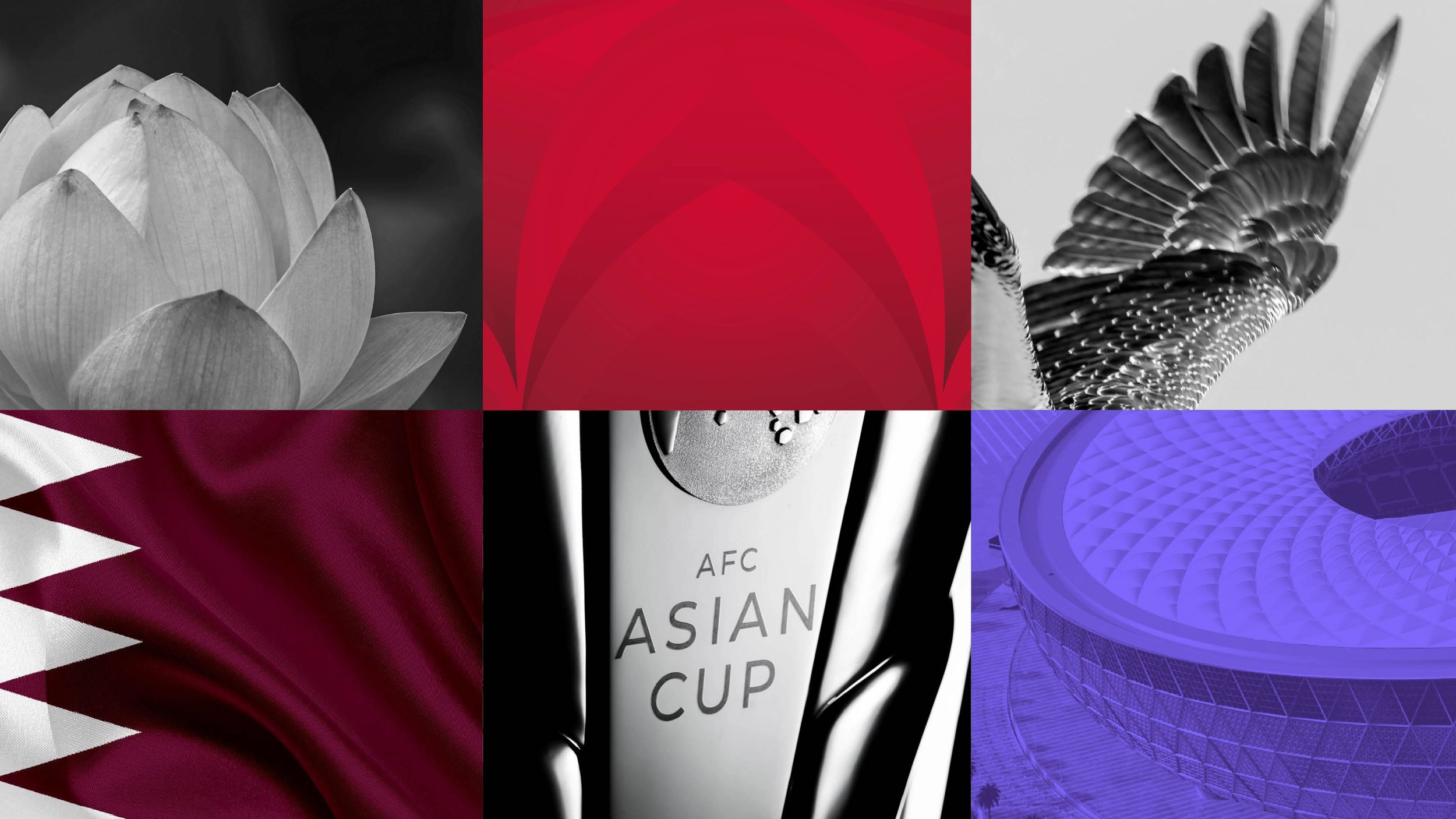
The original inspiration for the Thomas Lyte designed Asian Cup trophy was the falcon and the lotus. Both symbolic of Asia. The logo, designed by the Qatar organising committee team, highlighted these elements. The visual identity, we were commissioned to develop, uses both to create a varied and flexible design system. From simple line to more complex gradient, line and image. The line shapes of the lotus on the inside of the trophy are used for hospitality, VIP and VVIP to create visual distinction.


Brand guidelines and assets
A comprehensive 260 page guideline was produced covering the basic brand elements, specifics on Arabic typography, along with colour principles and design guidance on all the brand channels; stadiums, street dressing, banners, flags, volunteers uniforms, media, hospitality, VIP, VVIP, signage, social and broadcast.


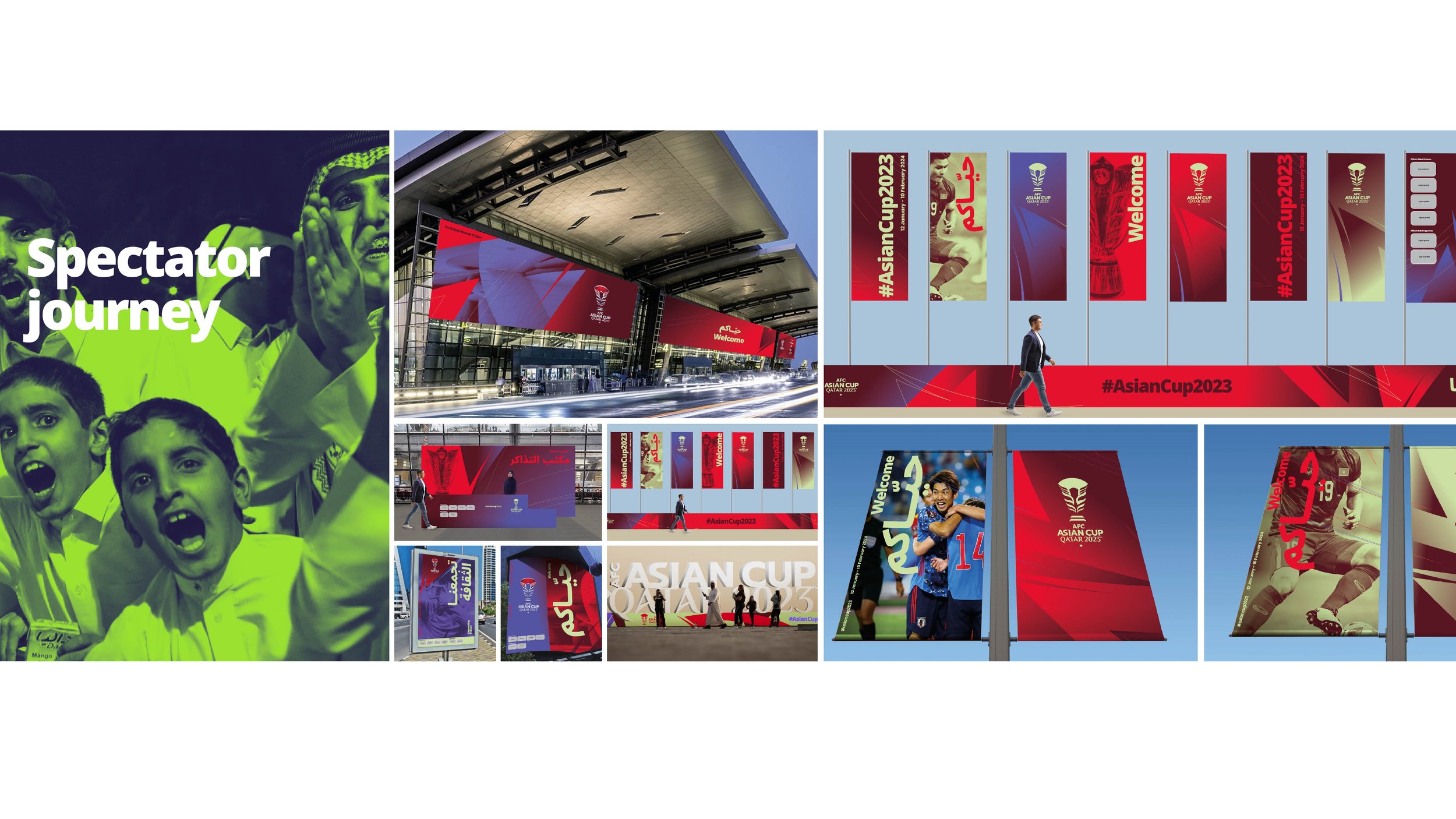
Spectator journey
Working closely with the FIFA World Cup 2020 design and implementation team in Qatar, we developed a colour and design strategy for the spectator journey. Using the learnings from the World Cup on colour and broadcast, a set of themes was created for each stadium and street dressing. Each theme was made up of darks, mid tones, a connecting lilac and unusual accent colours. All designed to signal a bright, positive ‘festival of football’.


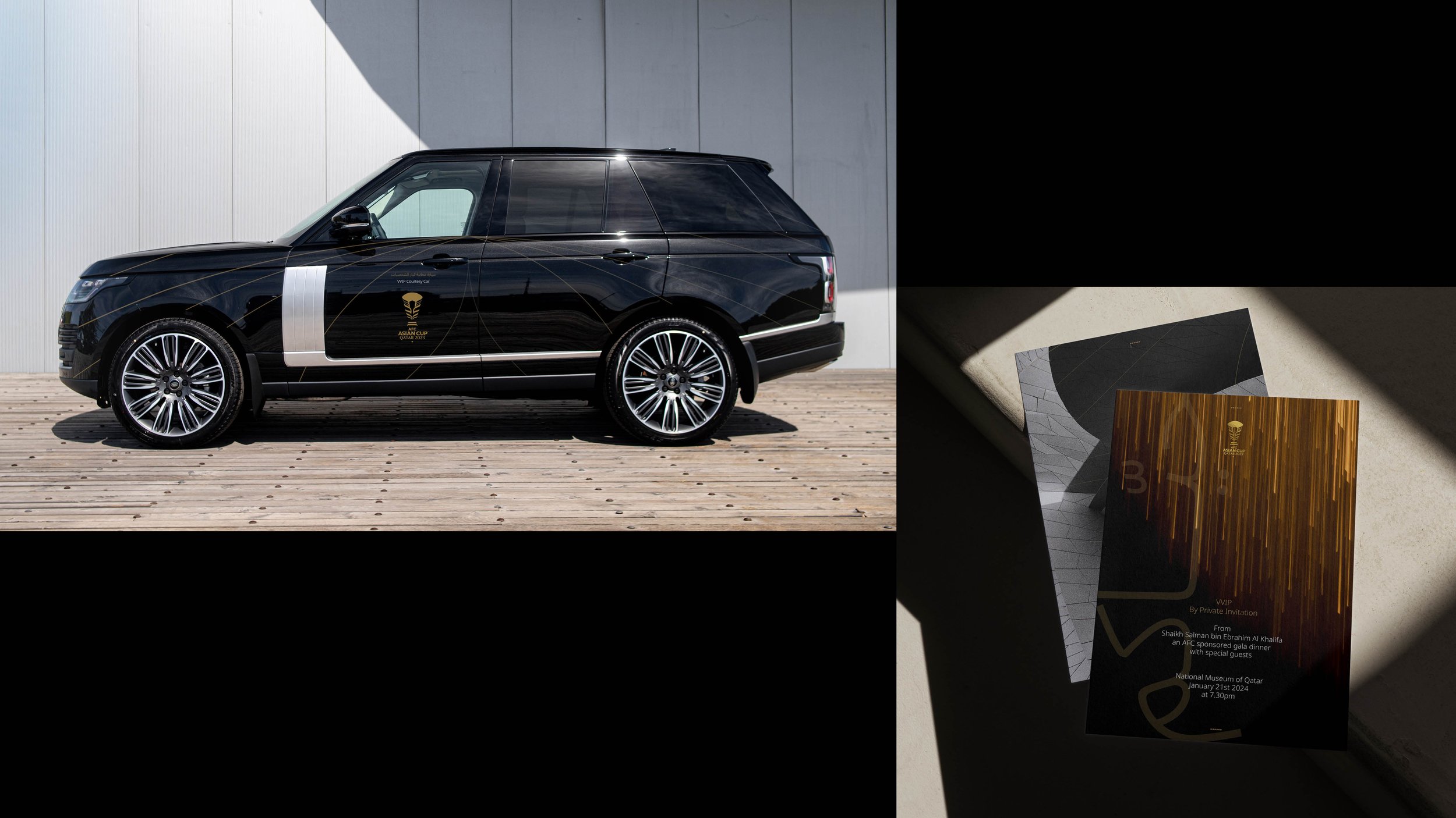
VIP and VVIP
Hospitality for VIP and VVIP needed to be distinct from the very colourful ‘festival of football’ channels. Based on cultural feedback we used a luxurious palette of white and gold for VIP and black and gold for VVIP. The line shapes of the lotus in the logo were employed to link to the trophy and give a sense of elegance and precision.


BRAND CHANNELS
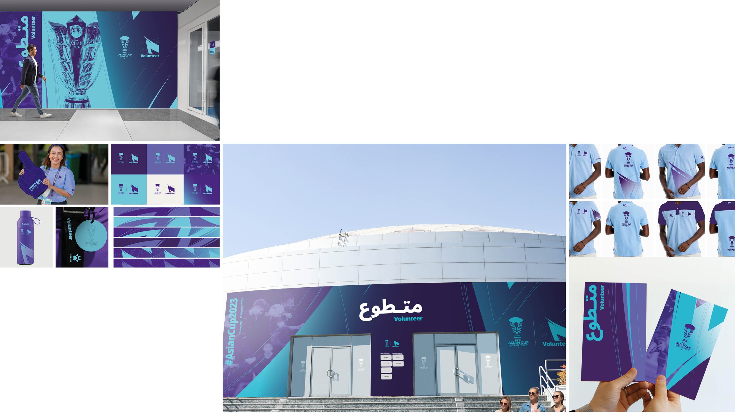
Additional brand channel designs for volunteers, media, ticketing and signage show how the design system and colour themes can be used for recognition. The dark purple, lilac and lime green theme was chosen as the core brand theme. It’s used on stationery, ticketing, signage, social media and the-afc.com website.


FINAL DRAW
The pre-tournament Final Draw was held at the Opera House in Doha. The Opera House interior uses Qatari maroon. We incorporated this into the pre-draw colour theme. Once the logo was revealed the colour theme changed to the eye-catching purple, lilac and lime green. This combination was carried into the tournament opening ceremony as the core colourway.


IMPLEMENTATION
The tournament visual identity and guidelines has been used by the Qatari and AFC design teams and multiple agencies to create all the branded material in the host city as well as all the digital applications.

